AI tools have made it genuinely easy to generate a custom hero banner, a feature panel, or a whole pricing table in minutes. You describe what you want, the AI writes the HTML and CSS, you paste it in, and it looks exactly right. Job done.
This article is part of my small business website guide.
Except sometimes it isn't. I recently audited a client's website as part of a Google Ads review and found a problem that had been sitting there, invisible, for months. It wasn't a typo or a broken link. It was a page loading in over 40 seconds on mobile, caused entirely by custom HTML sections that looked perfect on screen and were quietly serving enormous, unoptimised images underneath.
That case is specific, but the underlying problem isn't tied to any one platform. It applies just as much to a site built from scratch as it does to WordPress, Shopify, Squarespace, or a hand-rolled static site. Whenever AI-generated HTML and CSS bypasses the platform's own built-in handling for images, layout, and responsiveness, and it very often does, similar issues can creep in. Having seen this play out first-hand, it's a way of building a website I wouldn't recommend to a client. There are simply too many places for things to quietly go wrong, and every one of them is invisible until someone specifically goes looking.
This isn't an argument that AI is untrustworthy. It's a rundown of the specific, common, easy-to-miss ways AI-generated HTML can undermine a website, and how to check for them before they cost you traffic, rankings, or an ad account. It's exactly the kind of thing I look for whenever I'm reviewing a client's web design, because it so often hides behind a page that otherwise looks completely finished.
What Actually Happened
The site in question runs on Elementor, hosted through WordPress.com. It's a well-presented business site, and on first glance there was nothing wrong with it at all. The homepage had a hero banner. Further down, a set of repeated feature sections highlighted the client's airport transfer services, each with its own background image. All of it had been built using custom HTML and CSS blocks rather than the page builder's own native image widgets, a common approach when someone wants a very specific layout that's faster to generate with AI than to fiddle with inside a page builder's interface.
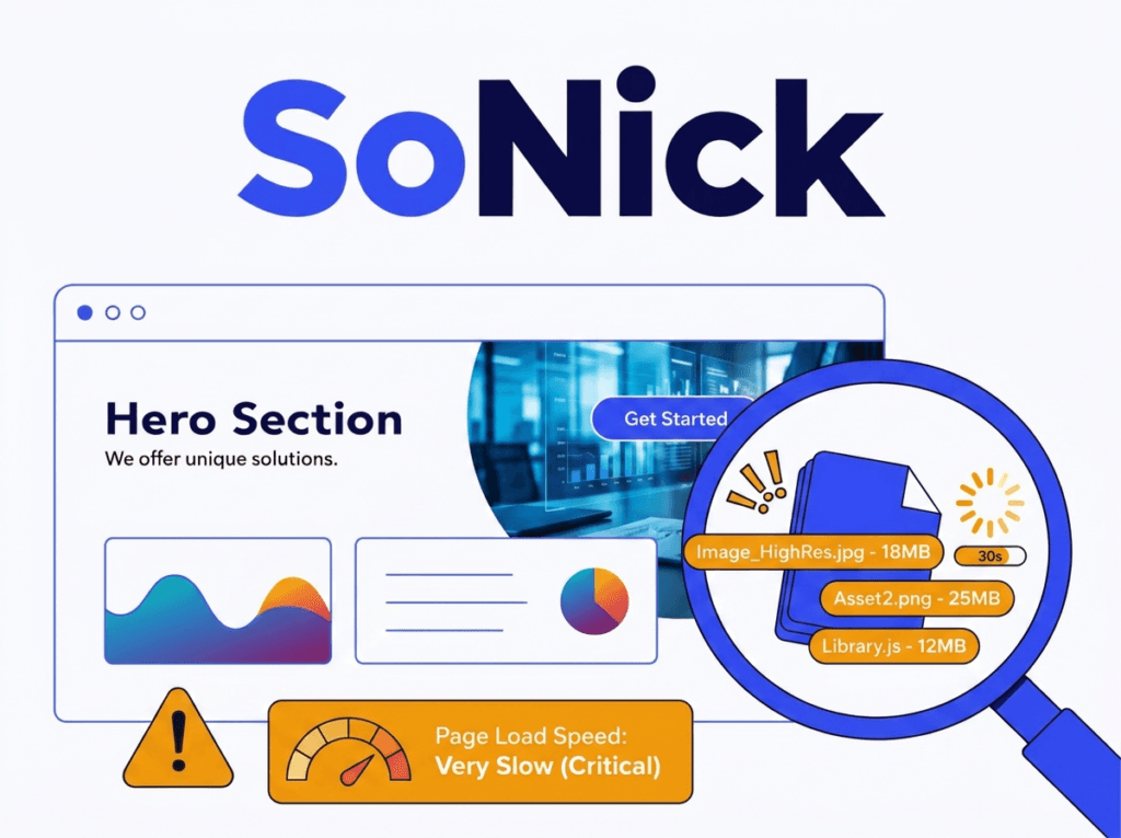
The client had a newly completed website and came to me to start promoting the business, largely through Google Ads. As part of the initial account setup and audit, I ran the homepage through Google's own PageSpeed Insights, a routine first check before spending a penny on ads. It told the story immediately: mobile load time was over 40 seconds. Not 4 seconds. Forty.
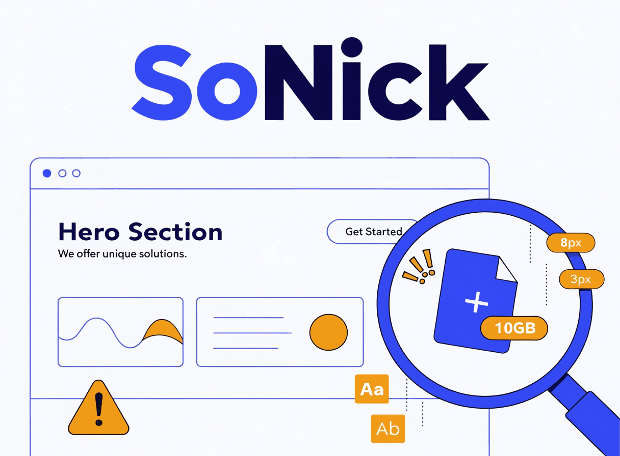
Digging into what was actually being downloaded, one background image alone was 4.4MB. The platform had already generated a properly resized version of that exact same image, sitting on the same server, at 426KB, over 90% smaller, with no visible difference in quality on screen. The custom HTML wasn't using it. It was pulling the original, full-resolution upload every single time the page loaded, on every device, phone or desktop.
That one image wasn't an isolated case either. The repeated feature sections were doing the same thing, each one quietly adding megabytes to a page that should have weighed a fraction of that.
Catching this before the campaign launched mattered more than it might sound. Google's AdsBot crawls a landing page as part of reviewing an ad, separately from how a normal visitor's browser loads it, and if that crawl times out or the server takes too long to respond, it can lead to a "Destination not working" or "not crawlable" disapproval, which can pause ad delivery until it's fixed. A 40-second load time is well within the range that causes exactly that kind of timeout. Finding and fixing it before launch meant the campaign never had to run that risk.
Why the Image Problem Happens, in Plain English
This is the clearest example of the underlying pattern, because the numbers are so stark, so it's worth understanding the mechanism properly.
Most content management systems and page builders don't just store the one image file you give them. They automatically generate several resized copies in the background: a thumbnail, a medium size, a large size, and often custom sizes defined by the theme. Then, when that image is actually displayed, the browser is told (via something called srcset) "here are several versions of this image at different sizes, pick whichever one actually fits the space you're displaying it in." A phone gets a small file. A widescreen desktop gets a larger one. Nobody has to think about it. It's automatic, and it's one of the quiet reasons a properly built page tends to load reasonably well even with lots of imagery.
Custom HTML and CSS, whether it's written by a developer by hand or generated by an AI tool, very often bypasses this entirely. This is especially true for background images set using CSS, background-image: url(...). That property has no equivalent mechanism to srcset. There is no built-in way in CSS to say "serve a smaller version of this to smaller screens." You give the browser one specific file, and that's what it fetches, every time, on every device, regardless of whether it's a 320-pixel-wide phone screen or a 2,560-pixel monitor.
The AI generating that code isn't being careless. It genuinely has no way of knowing, unless it's specifically told, that the file you've referenced is a 4.4MB original sitting in your uploads folder rather than an already-optimised 426KB version. The code it writes will look completely correct. It will render exactly as intended. It will pass every visual check you run, because visually, there's nothing wrong with it at all. The problem is entirely invisible unless someone actually looks at what's being downloaded and how long it's taking, which is a fundamentally different kind of check to "does this look right."
Does AI Write Responsive HTML by Default?
This is worth answering directly, because it's a reasonable assumption that AI tools handle responsiveness automatically. The honest answer is: sometimes, partially, and not reliably enough to skip checking.
Most modern AI coding tools will include media queries if you ask for a responsive layout, and increasingly even without being asked. But there's a real gap between "technically has some media queries" and "genuinely works well on every screen size." Common issues include breakpoints that are generic and hardcoded (typically 768px and 1024px, because that's what shows up constantly in training data) rather than chosen to fit your actual content, fixed pixel widths that don't scale gracefully between those breakpoints, and layouts that were tested, if tested at all, only at the exact breakpoint sizes rather than the awkward widths in between where things actually tend to break.
The practical result is a page that looks fine on your phone and fine on your desktop, because those are the two sizes anyone bothered to check, while quietly overflowing, overlapping, or misaligning on the tablet-sized or unusually-proportioned screens in between. Nobody notices until a customer on the wrong device does.
As with the image problem, this isn't the AI being unreliable so much as it reflects the way these tools work: the output is only ever going to be as good as the brief it was given, and a general instruction like "make me a hero section" carries a lot less responsive-design intent than "make me a hero section that works cleanly at 375px, 768px, 1024px, and 1440px, using relative units rather than fixed pixel widths." Most people asking for the first prompt have no way of knowing the second one was even necessary.
The Wider Pattern: Consistency and Craftsmanship
Beyond images and responsiveness, there's a broader issue that's harder to point to in a single screenshot but matters just as much over time: consistency.
A properly built website, whether that's a well-built WordPress theme, a Shopify store, or a professionally coded site, tends to be built around a shared design system. Global colours, fonts, heading styles, button styles, and spacing are usually defined once, centrally, and every element on the site pulls from that same source. Change your brand's primary colour once, and it updates everywhere it's used. Every heading looks the same because every heading is using the same underlying style.
AI-generated HTML blocks, especially when they're added one at a time to solve individual problems as they come up, don't inherently work this way. Each block is often generated in isolation, with its own inline styles, its own specific shade of blue typed out as a hex code, its own version of "the heading font." Ask an AI to build five different sections over five different sessions and you can easily end up with five slightly different shades of your brand colour, three different heading weights, and button styles that don't quite match, each individually reasonable, collectively inconsistent. It's rarely dramatic enough that a visitor consciously notices, but it does chip away at the sense that a site was built with real care and consistency, which matters more than it sounds for trust and credibility, particularly on a small business site where the website often is the first real impression of the business.
This connects to a wider point worth being honest about: what you get out of an AI tool is only ever going to be as good as what you put into it. If you know exactly what to ask for, specific breakpoints, a defined colour system, optimised image references, semantic HTML, you can get a genuinely solid result. If you don't know to ask for those things, because you're not a developer and there's no reason you should be expected to know this, the result will often look complete and finished while quietly missing all of it. That's a much harder trap to spot than a typo, because there's nothing visibly wrong to notice.
Other Things AI-Generated HTML Commonly Misses
A handful of other things a native page builder or theme element handles automatically, and that hand-written or AI-generated HTML very often doesn't, unless someone explicitly asks for them:
- Lazy loading. Native image elements typically defer loading images that are further down the page until a visitor actually scrolls near them. Custom HTML blocks frequently load everything up front, whether it's visible yet or not.
- Modern image formats. Most platforms can serve WebP or AVIF versions of images, which are substantially smaller than JPEG or PNG at equivalent quality. Custom code often just references whatever file format was originally uploaded.
- Accessibility attributes. Proper alt text, ARIA labels, and semantic roles tend to be built into native page builder elements as standard fields you're prompted to fill in. They're easy to forget when writing raw HTML, and an AI tool won't always add them unless asked.
- Semantic markup. Using the right HTML elements for the right job (proper heading structure,
<nav>,<section>, and so on) affects both accessibility and how well search engines understand your page. Generic<div>soup is easy to end up with when the priority was visual layout rather than structure. - Caching integration. Many performance plugins and platform-level caching systems are built to recognise and optimise native content. Custom HTML blocks can sometimes sit slightly outside that, depending on how they're inserted.
None of this means AI-generated code is inherently bad, or that there's never a place for it. It means it's optimising for a different, narrower goal than "will this perform well in production, consistently, across every device", and it's worth knowing that going in. If you're weighing up how much of your site to build this way versus relying on your platform's native, dynamic features, our guide to what dynamic websites actually are is a useful primer on where the trade-offs lie.
What to Actually Check on Your Own Site
You don't need to be a developer to catch most of this. A few practical habits will surface it every time.
Check actual file sizes, not just how the page looks. Right-click any image on your site (including background images, which you can usually find via your browser's "Inspect" tool) and check its file size. If a background image is several megabytes, that's worth investigating, regardless of how sharp it looks on screen.
Run a real page-speed test after adding any custom code block. Google's PageSpeed Insights is free and takes less than a minute. Run it before and after you add a custom HTML section, not just once when the whole site launches. It's much easier to catch a problem when you know exactly which change caused it.
Actually resize your browser window, or use your browser's device toolbar, and check the awkward in-between widths. Don't just check phone and desktop. Drag the window narrower and wider and watch for overlapping text, images that don't scale, or buttons that fall off the edge of the screen.
If you're using AI to generate HTML or CSS for your website, prompt it explicitly. Ask it to reference optimised, properly-sized images rather than originals, to use relative units and test genuinely fluid breakpoints rather than a couple of fixed sizes, and to match your existing colours, fonts, and heading styles rather than inventing its own each time. Don't assume any of this will happen by default, because none of it reliably does.
Treat this as a standing audit item, not a one-off check. This is particularly worth building into your routine before or during a Google Ads campaign specifically. Regular visitors are often more forgiving of a slow-loading or slightly-off page than they should be; they'll wait, or they'll bounce without you necessarily noticing why. Google's crawler isn't forgiving in the same way. If your landing pages are the destination for paid traffic, an issue that regular visitors shrug off can be the exact thing that gets your ads disapproved.
The Takeaway
AI tools are genuinely useful for speeding up parts of building a website, and there's no need to avoid them altogether. But as a way of building a site's core structure, custom HTML and CSS blocks generated piecemeal by AI is not something I'd recommend to a client. Too much of what makes a website reliable, image optimisation, genuine responsiveness, visual consistency, accessibility, is handled automatically by a properly built platform or theme, and silently skipped when it's replaced with one-off generated code.
The pitfall isn't the tool. It's assuming that "looks correct on the screen in front of you" and "performs and holds together correctly everywhere" are the same test. They aren't, and the gap between them is invisible until you specifically go looking for it.
If you'd like a second pair of eyes on this, run a free SEO audit and I'll flag anything like this that might be quietly holding your site back.